
What’s Standing Between You and a More Useable Website? 5 Minutes. (WSC10)
If you’ve ever looked at a website and had the urge to make it better, but didn’t know where to start — Mackenzie Huber and Whitney Tabbert’s session is for you.
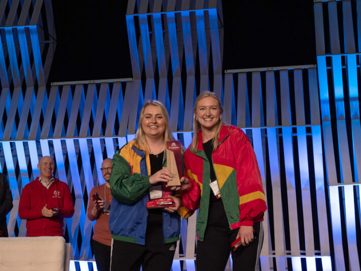
Dressed in flashy tracksuits that paired perfectly with the session’s track meet metaphors, the University of Wisconsin-Eau Claire duo provided a framework for improving web pages in just five minutes.
“Track is about getting about 10% better all the time,” said Huber, whose father is a track coach.
To do that, she cautioned against trying to make everything perfect. Instead, aim to ensure your web content is accurate, relevant and necessary using the following rubric.
Huber and Tabbert shared a six-part rubric during their Red Stapler- and Best of Conference-winning session, What’s Standing Between You and a More Useable Website? 5 Minutes.
The rubric
- Page title
- Headings
- Readability
- CTA
- Findability
- Brand alignment
Page titles
Page titles are important for a number of reasons, the most important being that they let your users know that they are in the right place. In higher education, it’s common to encounter generic page titles such as “Research” and “Scholarships,” but having too many of the same titles across a website does not distinguish one from another.
Page titles should be concise at about 60 characters or less, and should quickly provide users with information about what information they will find on the page.
Headings
“Headings are like the handoff for your user from one section to the next,” Huber said. They should be meaningful and describe the content contained within the section.
Furthermore, structured headings are important for both readability and accessibility, as screen readers and other assistive technologies use this information to read aloud the content on the page.
“You can’t just use heading 6 because you like it,” Huber said.
Readability
“Your job as a web editor is to remove as many hurdles as possible for your users,” Tabbert said.
Looking at a page filled entirely with “wall-to-wall” text can pose readability challenges. It also fails to provide users with a clear understanding of what is contained within that page, she mentioned. Using structured headings, lists and breaking up paragraphs into smaller sections, can aid in readability.
“Readability is also a chance to practice inclusion,” Tabbert said. Ensure the text on your websites is at an appropriate reading level, ideally around the eighth grade. Online tools, such as Hemingway, can be used to evaluate reading level.
CTA: Calls to action
When considering calls to action (CTAs), ask yourself if there is one on the page. And if there is no action a person can take, why does the page exist?
Higher education websites have CTAs on academic program pages, for example. But often, these elements are at the top of the page. Chances are, a prospective student isn’t ready to apply to a program at the same moment they are viewing a program’s details. In this case, consider helping the user accomplish their task — and the institution’s business goals — by allowing the user time to learn about the program, and placing a button to apply, for example, lower down on the page.
Links contained within CTAs should be descriptive with actionable terms such as “Apply” or “Request Information,” and avoid generic words like “Click Here.”
And be careful not to overload your users with too many CTAs.
“Too many CTAs is just as bad as no CTAs,” Huber said.
Findability
Findability refers to all the ways a user might get to a page on your website. It is through visible site navigation, search tools or cross-linking.
Tabbert explained how accurate meta descriptions, page titles and intuitive language can all contribute to web page findability.
“It can be frustrating as a user to keep looking for something,” she said.
Valuable pages on your site may not be used as much as they could be, simply because they are difficult to find.
Brand alignment
Pages within a website should offer users a consistent look and feel — in voice and tone, colors, photography, and so on. Think of this as the “vibe check” on your page, Huber said.
“Bad vibes do not equal a successful user experience,” she said.
One way to perform this vibe check is to look at your pages through the lens of a prospective student. Is there anything you wouldn’t want a prospective student or parent to come across? If you notice any red flags, consider revising that content or taking it down.
The rubric in practice
Session participants were then given an opportunity to put the six rubric topics to the test and evaluate their own websites. With a stopwatch in hand, Huber started the 5-minute timer.
When the timer went off, participants shared their findings with Tabbert and Huber. Missing alt text, higher than recommended reading levels, inaccurate page titles and confusing language were rampant.
“Literally every word of the body copy is identified as very hard to read,” said one participant, who had placed some copy from his website into the Hemingway tool to analyze.
The exercise demonstrated how taking just a few minutes can make a big impact on user experience.
“We want to make them [your web pages] a little bit better every time,” Huber said.
Link Journal has covered the HighEdWeb Annual Conference since 2011. Explore our archives for articles about previous conference sessions.
Stephanie DeBoer is associate director of digital communications at Brandeis University in Waltham, Massachusetts. Her expertise lies in crafting meaningful user experiences through digital content and design. She has played a key role in many prominent digital initiatives at Brandeis, including the recent transformation of the university’s news website into the visually engaging and accessible storytelling platform, Brandeis Stories.