View Session Details and Presenter’s Bio.
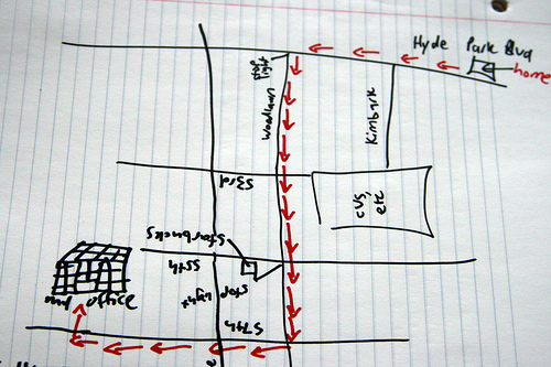
Photo by quinn.anya, Flickr.
The first thing Nick Catto has for anyone who is working on a campus map project is this:
“Why are you doing this to yourself?”
It’s not really as simple a project as it may seem to be on the surface, and Nick has a sense of humor in his presentation on why we have campus maps in the first place, including some hypothetical situations for three different audiences who each have their own campus map needs.
How can you help someone get to where they’re going without knowing where they’re coming from?
Nick calls this “Map Empathy” and it’s the key to serving the needs of your audience. It’s really the ultimate problem that good maps can solve. Take a look at a few examples:
Will Smith: Prospective Student
Remember the The Fresh Prince of Bel Air? He lives in Philadelphia (“born and raised”) but he’s getting pressure from home to look at a nice school out west. He wants to get a feel for your campus, where dorms are located in relation to academic buildings and athletics. How close is public transportation and where is campus in relation to the surrounding neighborhood and activities.
Interactivity and virtual tour elements are key for this audience, allowing them to test drive the campus and check out photos and videos which will hopefully entice them to come check it out for themselves. Keep it media rich and embed those elements right in the map as pop-ups in a layer that defaults for admissions visitors. Go where the prospective audiences are already too, and include an embedded map on your Facebook pages or other social profiles.
It’s also important to accurately reflect the culture of campus. Don’t go overboard with information; focus on the popular buildings, and don’t just put out everyevery building on campus.
Frodo Baggins: Current Student
Frodo is on a quest to find his way among the 100+ buildings on campus to obtain his class ring, but he’s not sure the best way to get to the campus store from where he is. He looks at the website for a map but all he can find is the same PDF image of the paper map that his school has used for years. It’s not that functional, it’s not interactive, and it’s really not mobile friendly. And everyone knows that only clueless freshmen carry around a paper map.
Unfortunately this is not an uncommon problem. There are many school sites that still rely solely on a PDF map that shows basic facilities, almost no landmarks, and because it’s not dynamic may also be inaccurate.
Frodo needs a mobile map and Nick points out several great tools that can be used to make this happen. Google has the most popular free tools that are available across all mobile platforms and browsers, and it has the wayfinding tools Frodo needs built in. And if what is already in the Google maps application for your campus isn’t accurate, you can submit edits for free (www.google.com/mapmaker) to improve your campus representation.
The keys are to keep it accessible from all platforms, be sure design elements are unobtrusive and don’t cover up important elements. Also be sure that the building codes only administrators use (“ADM”) are translated for users to understand (“Admission”).
Betty White: Visiting Grandma
Betty is a wealthy alum. She doesn’t “do” computers and calls her grandson for help on the web. Advancement is courting her for a gift, grandson is playing in his first big game, so she’s flying in to visit campus for the first time in years. The approach she takes to find parking and directions to the stadium are… well, let’s just say Nick uses Betty’s attempt to find what she is looking for to eviscerate the user experience of maps as they currently exist at www.sc.edu — there are just too many roadblocks and choices to be made that could be avoided by simply placing a visible link to the map right on the home page and make navigating, reading, and searching that map simple and intuitive.
Tips and Tricks
Lead all users to multifaceted approach: an interactive map with built-in wayfinding tools, including both the ability to print directions and mobile navigation. Don’t forget to coordinate with the on-campus experience, incorporating features into physical map displays and signage on campus.
A committee approach is the only way to really be successful to insure that all departments that are rely on maps are involved. Bring in key players and use a project timeline that includes time for usability testing, media/asset gathering and updating. Allocating tasks among the committee helps that happen faster, but you’ll benefit if outside agencies have the same single point of contact to work with. Consider your needs for design in terms of perspective and rendering style based on your budget, your timeline, and how much you expect maps to change over time.
And remember to show some pride — a well-done map is a work of art.
Takeaways
There is no single campus map solution to satisfy everyone who will need it. Put yourself in the shoes of your most frequent kinds of users and be sure you meet their needs in the ways that are best for them. Be mobile friendly, be Grandma friendly, and don’t show more information than you need to at once.


3 replies on “Lost in a Map: Understanding the Direction of Your Campus Map #heweb11”
Thanks for the great write-up!
[…] #tnt4 – Lost in a map: Understanding the direction of your campus map […]
[…] #tnt4 – Lost in a map: Understanding the direction of your campus map […]