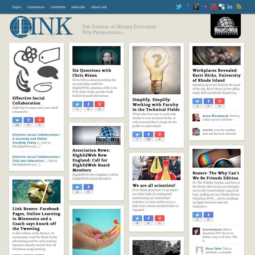
As you’re already able to see, we’re trying out a new look and style for Link. We hope our new pinboard feel — similar to what you saw when we blogged heweb12 and heweb11 — will allow you to discover additional tips, features and articles relevant to you and your work. As you scroll down the page, more content will load automatically; you can also use the navigation in the site’s header to browse articles by topic. We hope the new format will make it easier for you to comment on and share stories you find interesting.
We’re also shifting our publishing frequency: instead of publishing a new issue on the second Tuesday of each month, we’ll update more frequently, allowing us to better cover new developments and trends.
There are still refinements that need to be made, both in the design and content frequency, and that’s where I hope you’ll come in. Let us know what works for you and what doesn’t, either here in the comments or by sending us an email at link@digicol.org.
Thanks, and happy new year!


One reply on “New Year, New Style”
Like the new format, and curious about the decision to put the search
box at the bottom of the page. Would love to see a “behind-the-scenes”
discussion about how the design and content decisions were made.