Writing accessible web content should be a priority for everyone.
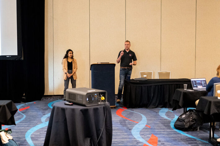
During a morning session on day one of the HighEdWeb 2022 Annual Conference, Sean Barnhill and Sofia Perez from Missouri State University College of Business provided a helpful overview of how to create more accessible content. This session focused on readability, and I’m going to use some of their tips to write this post!
Sean and Sofia started by sharing this quote from Albert Einstein: “It can take a touch of genius and a lot of courage to move in the opposite direction.”
They coupled this by saying we need to forget everything we learned in our high school English classes (sorry, Mr. Tuttle).

Readability explained
Readability is about the ease with which a reader can understand a written text. The readability of a page will strongly influence how a reader engages with online text. If something has high readability, there will be less misunderstanding. The reader will be able process information without expending a lot of energy.
We have to remember that the average reading age of adults in the U.S. is about 7th/8th grade, and at least 1 in 10 visitors to a site will be dyslexic. A recent study by Microsoft even says the human attention span has dropped to eight seconds.
It also helps to know how people read. Most people do not read one word at a time; they bounce around, especially online.
Best practices
These are important things you can do to give your web content higher readability:
- Use less than 25 words per sentence
- Use 1-3 sentences per paragraph
- Keep words to 1-2 syllables (this was new information for me)
- Use visual elements to break up text
- Use headings to break up sections
- Use bullet points
Sean and Sofia said if we remember one thing from this session, this is it: When you write more, people understand less. Think, “less is more.”
When I work with our site editors, I ask them to think about why someone should care about the information on a particular page. Sean and Sofia said the same thing. A reader’s number one question is usually, “What’s in it for me?” We need to put the most important information right up front.
Lastly, they shared a free tool I was not familiar with but I used it for writing this post. The Hemingway app lets you paste in your text and it will highlight areas you need to edit for readability. It showed me a few sentences I needed to shorten.
It may be challenging at first to reduce your sentence length and use simpler phrases, but doing so will benefit all those who come to your website.
Meaghan Milliorn Fikes is director of content strategy with the Office of Communications and Marketing at the University of Arkansas at Little Rock.

