It’s always fun when you receive less-than-specific guidance on mission-critical campus projects, especially related to the web. At HighEdWeb 2017, Martin Sickafoose from Purdue University showed us that even something as nebulous as “make the website cool” can be accomplished through data-driven, strategic decisions.
A brief history of Purdue’s website
Martin started his presentation by taking us back in time, all the way back to 1997. Remember when this was a cool website?

Redesigns followed in 2000, 2005, 2008 and 2010. At this point in the timeline, we see a site that still looks like a lot of campus websites in 2017—a big carousel, and a whopping 183 links on the homepage.

But nothing is ever good enough for Martin. I’m pretty sure Martin is a dreamer. In 2010 he started to ask really out-there questions, like, “What if we built a website focused on our audiences?” His motivation was largely fueled by a desire to speak to each audience in the way they want to be spoken to, like how television ads had long been created for different demographics. The Web was becoming a main channel for media consumption, so why should campus websites not respond in the same way?
Major impact from audience-based redesign
Four years later, a responsive, audience-based redesign rolled out, and Martin was ready to crunch the numbers and see if it was having an effect. The results were astounding.
- The site was more popular. Alexa ranks the popularity contest that is the Internet, and Purdue became three times as popular after the 2014 redesign, steadily improving with small, data-driven design iterations. By November 30, 2016, purdue.edu was the 1,302nd most popular website in the world.
- Web visits exploded. From 2014 to 2016, visits to purdue.edu tripled. And at the end of 2016, they had more mobile visits than their total visits in 2014.
Life was great and everyone is happy, right? I mean, if I was the Board of Trustees, I’d probably have given Martin a puppy. But a certain board member with experience in a sector outside of higher education wanted more. She wanted the website to become cool. So, how do you define cool? With data, of course.
Using data to build a “cool” website

Martin consulted two main data sources to figure out what the cool new purdue.edu would look like.
- Google Analytics – He observed cyclical trends in traffic across the domain, sources of traffic, paths users take to navigate the website, and search terms.
- BrightEdge – He analyzed what keywords were driving traffic to the domain, to get an idea of what users wanted.
Basically, Martin determined that what is cool is highly personal, and at a much more granular level than audience. So now, purdue.edu has yet another iteration.

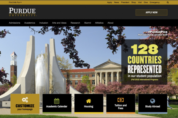
Homepage links are down to about 90, and the hero image has returned (but this time it’s user-generated). Topics that the data indicated were important to users are elevated on the homepage. And later this year, Purdue will start testing a completely customizable homepage design so the personalization is not just audience-based, but down to the individual user level. I’m hopeful that Martin will share some of those results with us at HighEdWeb 2018.