Catherine Harwood, manager of web & social media at Eastern Florida State College prefaced her presentation with a note, that participants don’t need to be web developers to master designing content for mobile.
It’s important because, as Harwood notes, more and more of our users are getting to our site via mobile sources. They arrive thanks to things like social ads, but Harwood also warned the audience that although they get to your site on their phone, they may return later while on their desktop. According to the E-Expectations report, there was a 10% increase in one year of the number of high school juniors and seniors who prefer mobile optimized websites (44%).
While Harwood and her team didn’t do a mobile-first design the first time around, she mentioned there are some things you can do in the mean-time if you’re in the same boat, before your next redesign.
First pick the low-hanging fruit. Have you ever landed on a website and wanted to dial the phone number, but there’s no area code? That’s important. With an area code, your users can simply tap the number to auto-dial. You can also run an analytics report to find the most visited pages to figure out the priorities as you start on this effort.
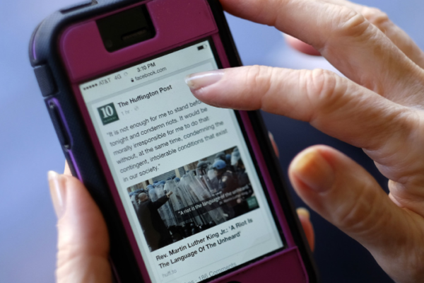
Take a look at your content – do you use the phrase “look on the right column” in your body copy? That’s no good, as things will shift-shape depending on the device. Speaking of text, if there’s “walls” of text (tons of text on your screen for the mobile version), your readers will scan right over it.
BUT WE NEED IT! they will scream, and you will say “let’s break this up with headings, bullet points, and white space.”
Edit, edit, and edit some more, Harwood explained. Think about your content, and if you can get away with cutting it down, do it! Get to the point quickly — your readers will thank you. Coined by Leslie O’Flahavan, Harwood emphasized the “bite, snack, meal” approach:
- Bite: headline. Does it grab their attention and fit in one or two lines on mobile?
- Snack: first few sentences. Do they summarize the page content?
- Meal: scroll-worthy content. Here you should use use subheads, bullet points, and whitespace.
Harwood emphasized concise and short are not synonyms. A piece may be long, but it may need to tell a longer story. Consider a shorter way to say something – like “now” instead of “at this point in time.” Two resources that Harwood uses to cut down on word count are Plain Language and Hemmingway App.
In an eye-tracking study, 70% looked at a list with bullets, compared to 55% who did without. Thinking about this, Harwood also investigated how navigation and links should work on mobile. Hyperlinks are very important, but be sure that you give some padding between them if they’re in a list – no one likes accidentally hitting the wrong link on their phone. Harwood and her team developed a widget that spaced a bulleted list and is now implemented across the site.
Tables can be tricky, as many know. It’s important to set the width of each table to 100%, and everything will fit nicely. For those larger tables that users can swipe around, adding a visible scroll-bar lets the user know that they can navigate the table on their phone with their finger. Oh – don’t forget your calendars.
Harwood discovered, as she worked to implement her ideas, to “share the why.” Explain to users why you need them to develop content in a specific way, and they are much more likely to comply.
As you start working on mobile-friendly content, you can use an emulator such as screenfly.com to take a look at what your pages look like on any type of device from tablet to smartphone, as well as a specific type of phone. Harwood also mentioned that there’s no substitute for looking at a page on your own smartphone and training your page editors to do the same.
One reply on “#AIM4 – Mobile First: Writing and Designing Page Content in the Age of Mobile”
Hey Jackie, you’ll wanna fix that Hemingway App link — you’ve got it slightly misspelled, and that actually points to some scary malware. Here’s the right one: http://www.hemingwayapp.com/
Cheers,
Jake